The summer is almost over and so we will soon resume posting as we did during the season, with a special twist. We have jumped on the bandwagon and gotten ourselves a stats gal, so you can look forward to some much more intellectual and analytical posts than any of the crap I write. And on that note…
So over the last week there was some talk about the NHL expanding to four different locations: Quebec City, Toronto, Las Vegas, and Seattle. Some of these (Seattle) have been a proposed site for a team for years. Some seem like wishful thinking. But the real question of course is not if the NHL will really expand. No, the question is what those teams will be named and what they will look like. I humbly present High Heels and High Sticks’ proposals for NHL expansion teams.
Quebec City
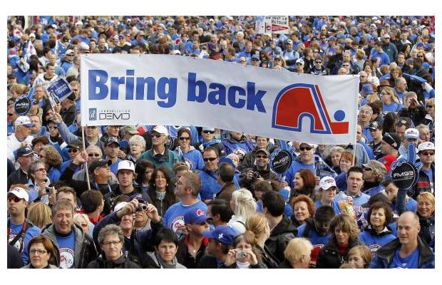
Name: Quebec Nordiques. Is this even a question? Just as when the thrashers moved to Atlanta, so too will the Quebec City fans demand a return of the Nords. And why not? May as well go with what works.
I say “will demand” but actually mean “are demanding.”
Logo: Again, no change. The igloo/letter n and hockey stick, which has always looked like an elephant to me, is iconic. It’s also my personal favorite logo, so I’d welcome the chance to buy more swag with it. Let’s not go to that weird wolf logo they were going to use before being relocated to Colorado.
Colors: I’d like them to go with powder blue just to separate them a bit from the Canadiens. Also, I think we need more pastels in the league. There is nothing better than a big burly defenseman clad head to toe in baby blue.
Fun Feature: Everything is in French but they’ve got you covered – the jumbotron has English subtitles.
Drawback: No one will want to play there because the taxes are so high, unless there are roughly a hundred strip clubs within a block radius of the arena like in Montreal.
Predictions: They spend like three seasons trying to get Patrick Roy to coach their team only for him to end up on the Habs when Therrien goes. At some point this happens again:
Toronto
Name: Toronto Fords. The reasoning for this can be easily summed up by me not knowing anything Toronto is known for despite having actually been there and Hannah reminding me that Rob Ford exists.
Logo: A giant empty space with a question mark to represent everyone’s feelings about the existence of the team, Rob Ford, and life in general.
Colors: Snow white and brick red with hints of regret.
Fun Features: Every three months there’s a lively and spirited debate over the merits of having two teams in Toronto. Meanwhile, the NHL board of governors sit and count their revenue while cackling in delight and high-fiving each other. And when the Leafs miss the playoffs for, like, the fourth time in a row, the Fords offer to switch out a Leafs jersey for one of theirs for free.
Drawback: Every three months there’s a lively and spirited debate over the merits of having two teams in Toronto and by the end of year two we’re all ready to fold the team just to make it stop.
Predictions: The Fords do okay for a few years, make a few great deals, and then win the Cup while the Leafs’ drought is extended another miserable year.
Las Vegas
Name: Las Vegas Aces. I debated this once, asked around, thought about the Gamblers (feels like an MLB team name to me), the Jokers, the Blackjacks, the Slots, the Hangover…etc. But “Jaromir Jagr was a great Ace” has a nice ring to it (and we know he would sign with them while the ink on the expansion contract was still drying).
Logo: A poker chip, or possibly a small stack of poker chips with one jauntily tilted to the side.
Something like this. There is also a casino inside the arena.
Colors: Red and black seem like a nice idea, but I also like the idea of it being money green. We need more green jerseys in the league.
Fun Features: Instead of ice girls, they have showgirls, and they do a can-can in skates at center ice before the puck drop.
Drawback: The crowd will sometimes turn violently against the Aces because goddammit, can’t you just lose this game so I can win my pool?
Predictions: Every away team at the Vegas arena seems oddly slow and out of it. Almost like they’re hungover or something? Nah, can’t be. These are professionals, after all. The Aces are a perennial wild card team.
Seattle
Name: Seattle Grunge. All props to Hannah for that one, and I think it’s totally justified if we have a team called the Blues.
Logo: A totally rockin’ guitar with the Sears Tower in the background. Their alt logo is the Starbucks logo.
Colors: Plaid. Full-on plaid in shades of red, grey, and white with some green in there.
Fun Features: Their goal celebration song is Come As You Are:
Drawback: They are constantly selling out of their baked goods at the concession stands thanks to people who just came back from a “smoke break.”
Prediction: It doesn’t even take a full season before they’re featured on an episode of Grey’s Anatomy because that show is seriously running out of ideas.