Or, Do People Actually Buy This Stuff?: I read the NHL Holiday Catalog so you don’t have to.
I discovered recently (as in about two weeks ago) that the NHL Store does a catalog. I’m not sure when the last one was sent but I’m hoping it was more than two weeks ago because if I’m in for a biweekly NHL catalog my neighbors might start to notice that in the recycling shed.
Anyway, today I came home to find their “holiday” catalog in my mailbox. Let’s start with the cover.
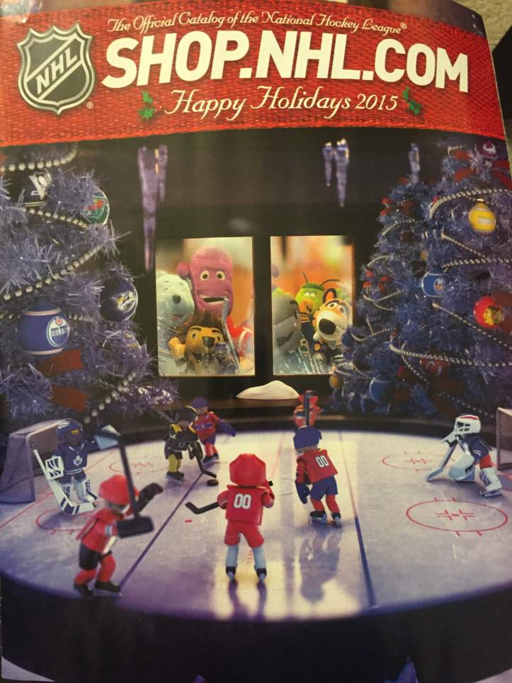
This is horrifying. First of all none of the players are wearing the same jerseys. Is this supposed to be the All-Star Game, attended only by terrifying plush toy versions of NHL mascots? It’s very nicely shot, I will say that. Dramatic. Definitely better than the last one.
I don’t generally have a high opinion of NHL manufacture merchandise. A lot of my favorite hockey-related merch is unofficial. (Look, NHL, you guys have enough money.) Still, they sent me this for some reason, so I went through it and took pictures of some of the highlights.
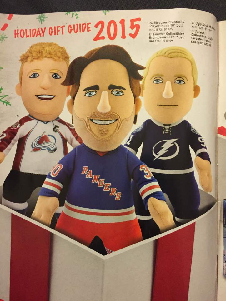
Am I the only person who finds these plushies impossibly creepy? This is the first page inside the catalog, and they choose to highlight the alleged plushie of Henrik Lundqvist, which I feel is a dreadful mistake since all it does is reveal how terrible they are at creating stubble. I will admit that I too am at a loss, unless they decided to go the embroidery route. But it just looks so weird, especially since the fabric they chose to represent stubble is close to the skin tone. He looks like he’s Buffalo Bill with an incomplete human skin mask. Who do they think he is, Carey Price?
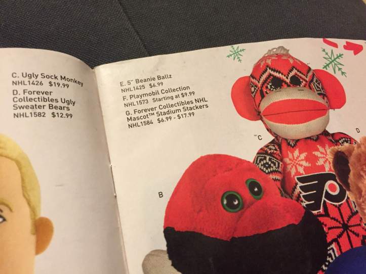
I’ll admit that I don’t have an issue with this. I just think it’s funny that it’s an “Ugly Sock Monkey” and they chose to show a Flyers one. Ah, I love the smell of ad hominem attacks on your rivals in the morning.
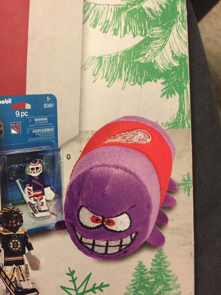
SUPPOSEDLY this is a “stadium stacker” made to resemble the Red Wings mascot. First of all, what does stadium stacker mean? Are you supposed to bring it to the stadium to sit on or put behind your back for ergonomic reasons? Why does it look so terrifying? Why does it have those weird stubby nubs?? WHY WOULD YOU WANT THIS ANYWHERE NEAR YOUR BODY.
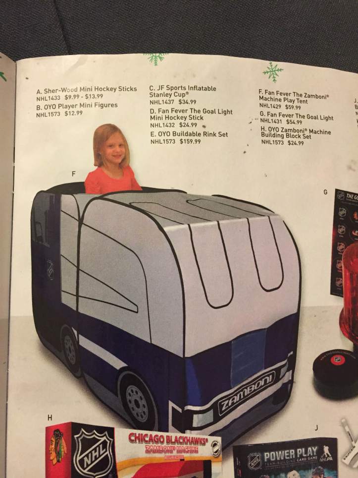
So many of my fond childhood memories involve the ice rink. I was a figure skater as a wee thing and I spent a lot of time at rinks, at skating lessons, going to see skaters perform, or just generally having fun. And let me tell you, I hated the zamboni. Sure, it made the ice all nice and smooth, and that was cool, but it meant I had to get off the ice. Never would I have wanted a play zamboni, and I once made myself a fake Spice Bus out of a large cardboard box.
Also, I’m kind of confused by the play tent thing. Shouldn’t play tents be a little bigger than that? I think maybe one or two kids tops could fit inside there, and what do you do once you’re inside? If you have a castle play tent, that makes sense: you pretend to be royalty or a knight. If you’re inside a play tent zamboni, do you…mop the floor?
Oh my god that’s it. This is how parents get their kids to mop the floor for them. I see it now. That’s genius. Bravo, NHL. Bravo.
Here I am, idly flipping through this catalog, when I see THOSE monstrosities in the bottom left hand corner of my page. “WHAT ARE THOSE!” I yell at my empty apartment. I look frantically for some explanation. There is none. Have I hallucinated them? Are they real? Will I wake up to find my bed surrounded by a small army of them?
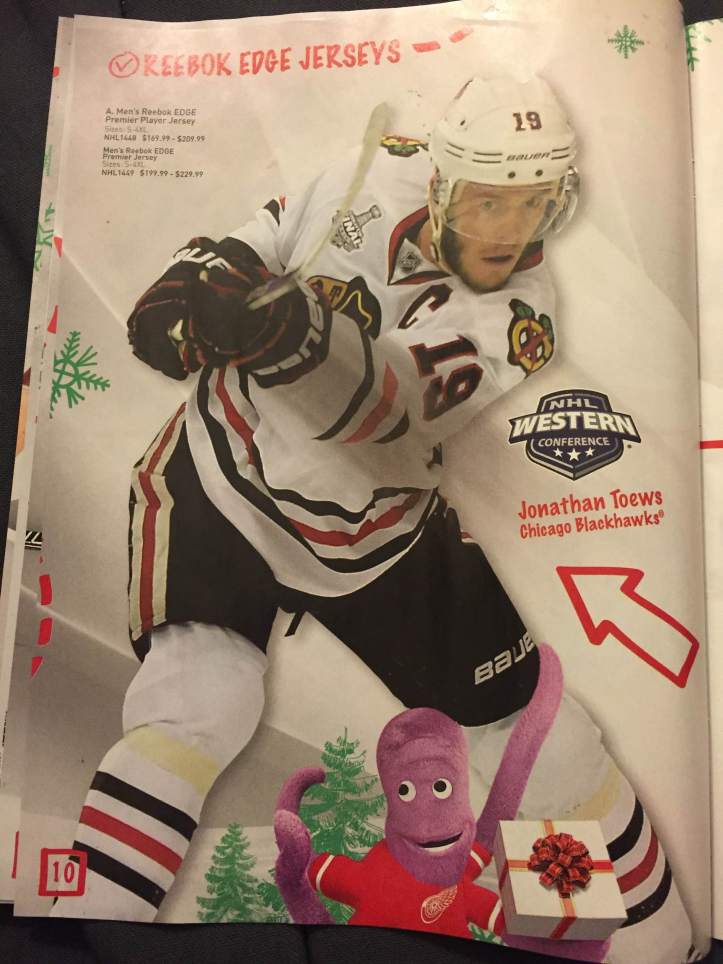
See, NHL? The Red Wings mascot doesn’t have to be terrifying! He’s downright cheerful here, even as the captain of his team’s rival shoots awkwardly at something in the distance. He’s smiling, and apparently trying to caress Jonathan Toews’s knee with one of his tentacles. You cheeky octopus, you.
(By the way, that octopus shows up on like every third page. Not with the other mascots. Just the octopus.)
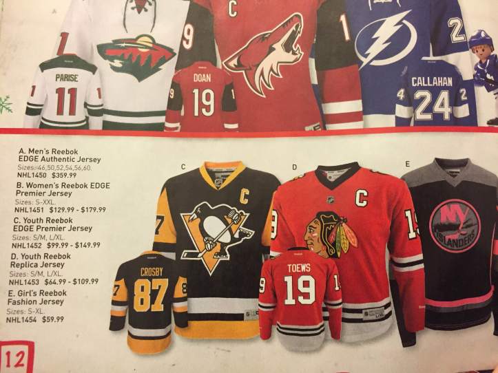
Look, I’ve complained about these “Girls’ Fashion Jerseys” already, but I’ll reiterate that making something for girls doesn’t mean just slapping some neon pink on it and calling it a day.
On the other hand, I think I prefer these to the Islanders’ current thirds.
This isn’t funny, so sorry about that, but when I flipped to this page, I barely kept myself from yelling ARE YOU KIDDING ME? After this past year and past summer, two of the players they chose to illuminate on this page are two players with history of domestic abuse?
You have to do better, NHL.
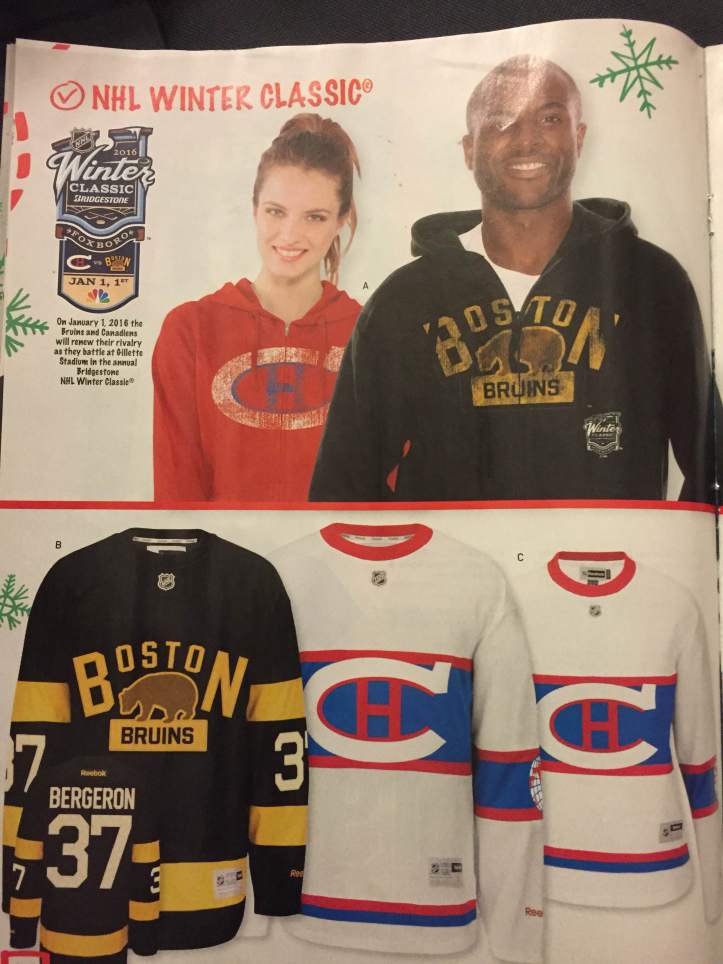
I don’t think I’ve actually seen the Winter Classic designs before this. At first glance, I did like them. Obviously the Habs logo is hard to screw up, although it’s VERY white. And I like the bear on the Bruins jersey, but why is the B and the N SO MUCH BIGGER than the rest of the letters? It’s not even like BN stands for anything related to the Bruins. I don’t know…I think I prefer the previous thirds.
“Are you sure, sir? Doesn’t that seem like overdressing?”
“No. I want to make a good impression.”
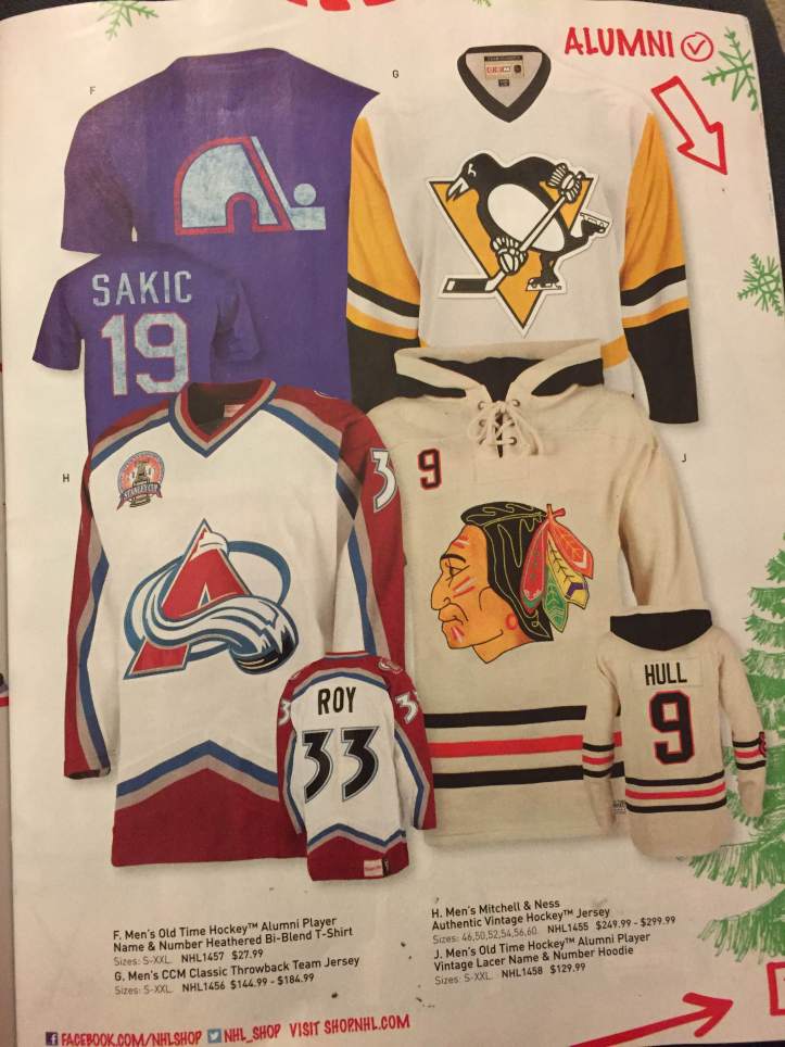
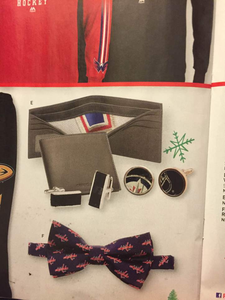
I always see stuff like the cufflinks, the bow ties, the ties, the jewelry, and all I can wonder is, unless you’re associated with the team, when would you wear those? It’s rarely even done in an elegant way, with maybe a minimalist version of the logo that is subtle and could pass for something else. It’s CAPITALS CAPITALS CAPITALS all over your bow tie. And I feel like that’s only going to be acceptable in very particular situations.
Here’s what I said on twitter about this, because nothing else I say can possibly top it:
Also, and someone else brought that up, why is there a tinier version of the logo RIGHT ABOVE IT? This is like my Canada sweatshirt that has about fifteen maple leaves on it.
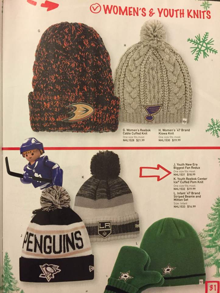
These are actually pretty nice. The beanie and mitten set is cute. And that’s a really nice cabled hat. Good job, guys. Hats are something you (mostly) know how to do.
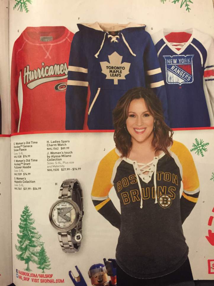
I genuinely thought they discontinued the Alyssa Milano line. That’s all I have to say about this.
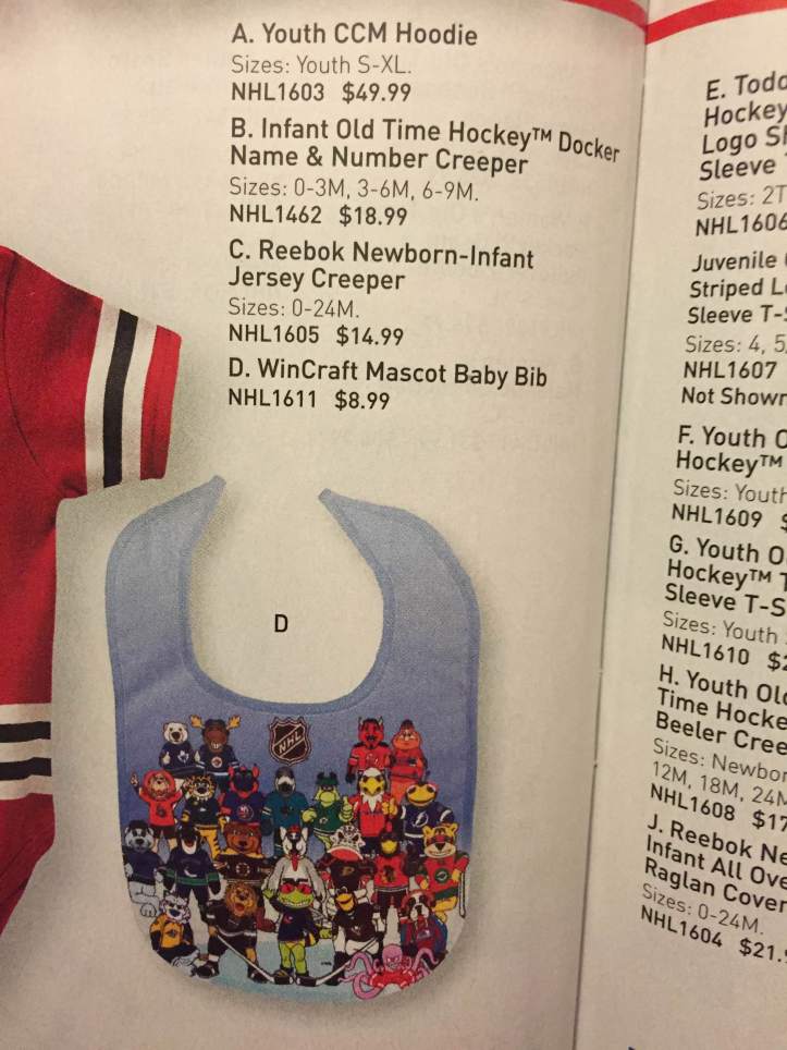
Here, my newborn child. Have a terrifying array of semi-clothed humanoid animal things staring at you intently. This won’t emotionally scar you or anything.
THERE’S ANOTHER ONE OF THOSE CREEPY ANGRY BLOW UP DOLLS. And once again, there is no actual explanation! It’s just under “Toys and Plush.” What is it?? A matryoshka doll? A bowling pin? A manifestation of your darkest dreams? DEAR LORD GET IT AWAY FROM ME.
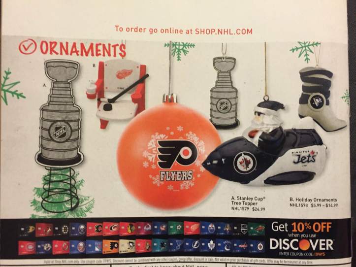
Hey, remember how hard it is to be a Christian in the NHL? (Also, I don’t get the boot ornament. It should be a skate. This makes no sense.)
Follow us on twitter for more NHL Store Hot Takes.

So funny! Thanks for sharing, Jonesy. The folks at Shop NHL have really lost their minds, I think. Isn’t there any kind of quality control?? (“STINGER! WHERE ARE YOUR PANTS?” HAHAHAHA)
LikeLike